• Waxwing
• Scaup
• Grebe
• Tags
• Veery
• JavaScript Editor
• Kinglet
• Junco
• ToledoWX
• Yo Notifications
• Baby University
• My iPhone
• Wren
• Map Mashups
• ToDo
Screenshots of My Web Apps
Parula
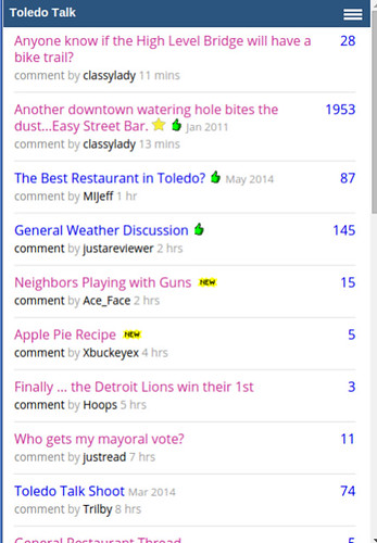
Used at http://toledotalk.com since 2005. ToledoTalk.com began in January 2003.
View of the site with the browser resized to approximate a mobile view.
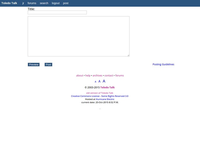
Desktop view of creating a new thread post.
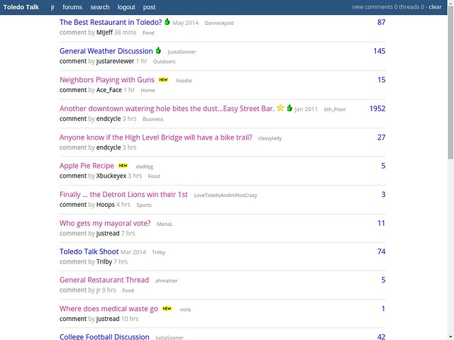
Home page view when logged in.
Waxwing
Used at http://waxwing.soupmode.com
Small image uploader app with stream views. A post can also contain text, including hashtags. String search and hashtag search exist. Browser-based JavaScript resizes the image before uploading.
Adding or uploading an image. This works fine on a phone too, except with versions of iOS prior to version 8.
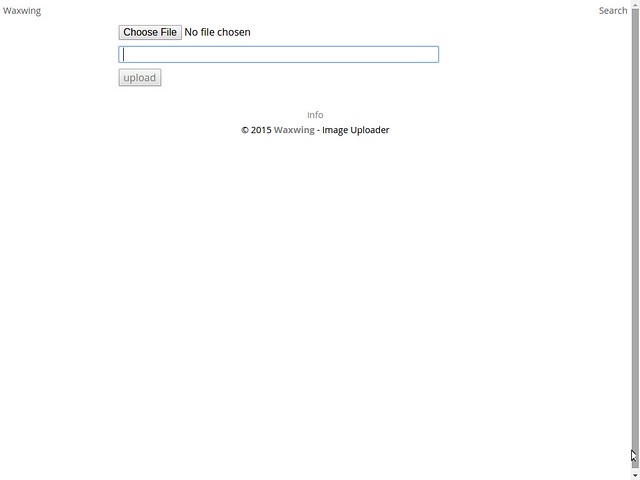
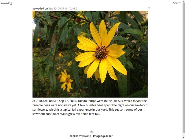
Desktop view of one of the posts or an "article" page.
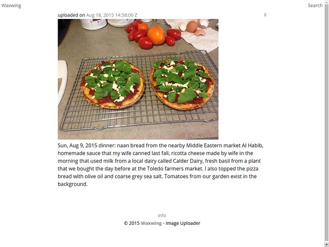
Another view of a post page.
Scaup
Used at http://crochet.soupmode.com to track my crochet notes.
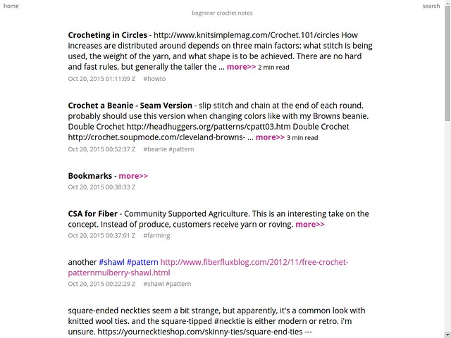
Scaup is a small, single-user web publishing app. Scaup stream views display a mix of articles and notes.
Desktop view of the home page stream while not logged into the app. If logged-in, then a small text area box would be positioned at the top of the site to allow fast posting of notes or links.
Grebe
Used at:
- http://maketoledo.com
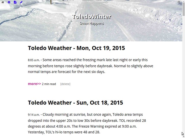
- http://toledowinter.com
- http://babyutoledo.com
Grebe is a multi-user blogging tool or web publishing app.
The default setup is to display only article pages on the home page, sorted by updated date from youngest to oldest. Standard blog view.
A notes stream is displayed separately. This screenshot shows the stream of notes while logged in.
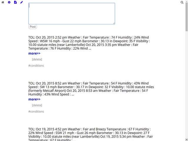
In the above image, the icons shown at the top from left to right represent:
- grey house : link back to home page of articles.
- blue gear : link to the user's profile page that contains links to account or profile settings for the user when logged in.
- blue paper : displays the notes stream shown above.
- blue pencil : large a larger text area box that allows more room for writing. On this page is a link to the enhanced writing mode, which is a JavaScript-based editor, which is what I'm using to create this document.
- grey magnifying glass : link to a page that displays a text input field for text to be searched.
The blue icon images appear when the user is logged into the app.
ToledoWinter.com home page while logged in.
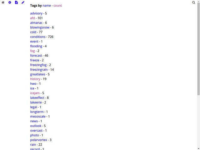
Tags
List hashtags and their counts alphabetically by tag name.
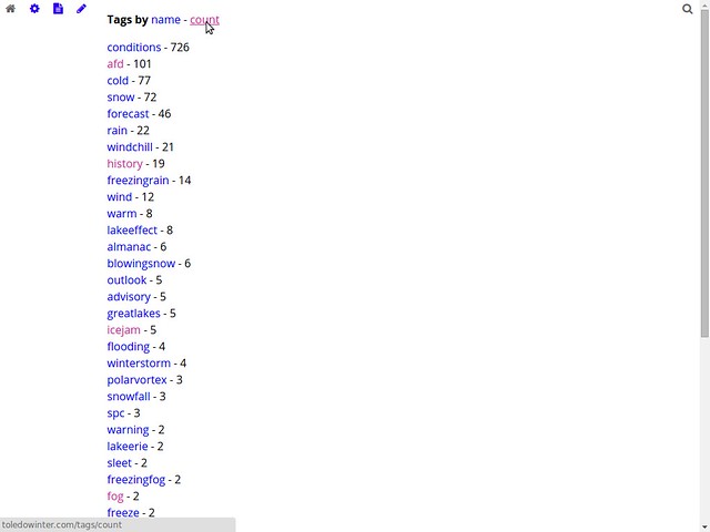
List hashtags and their counts by tag count, highest to lowest.
Veery
Similar to Scaup, except the code is separated into API and Client. Currently, the API code exists in Perl, but a version created with Go is planned. Client code exists in Perl and Node.js.
To log in, only an email address is submitted that matches the author's info that's stored in CouchDB. Veery send a link that when clicked will log the user into the app. The login link will only work one time.
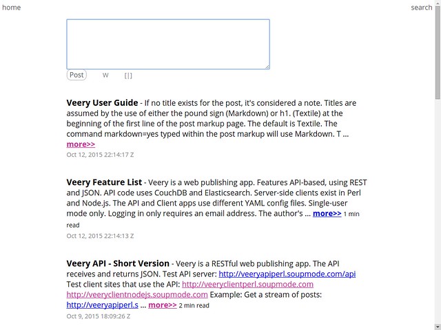
Home page stream view when logged in. The small text area box can be used to create an article or note.
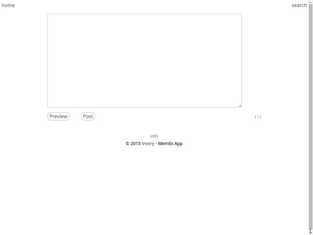
This is the larger text area box for creating a note or article. This is accessed after clicking the 'W' link in the above screenshot. Clicking the [|] link in the above screen shot would bring up the JavaScript editor or enhanced writing mode.
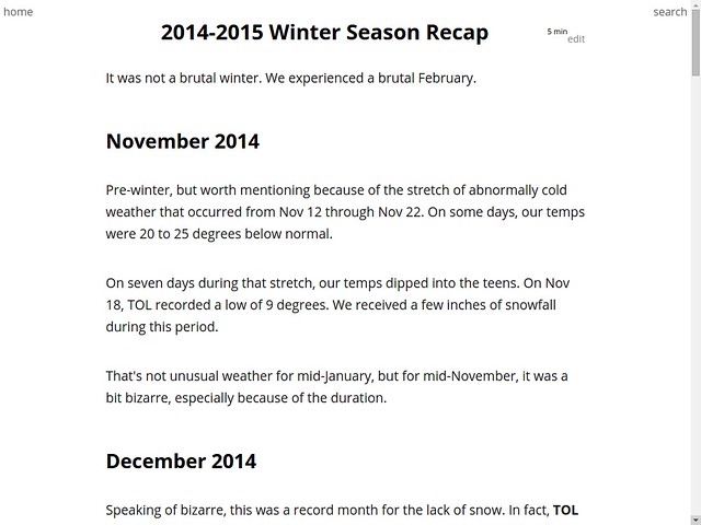
Desktop view of an article page.
JavaScript Editor
"Editor" may be an inappropriate term to use describe this browser-based JavaScript tool. This enhanced writing environment is used with Junco, Grebe, Scaup, and Veery web publishing apps.
The original code is found at: http://borgar.github.io/textile-js
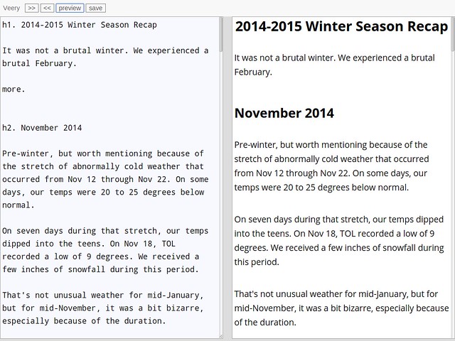
The original JavaScript provides a Textile live preview editor. The code splits the screen. An author writes markup in the left pane while the right pane provides a live preview of the formatted text. The brower JavaScript converted the Textile markup to HTML.
When testing the code in the summer of 2013, I found the flashing of the live preview annoying and distracting as I typed, since I could see the live preview out of the corner of my eye.
I greatly modified the code. I used the small minified.js framework to make my changes.
I eliminated the live preview. All my apps contain custom formatting options along with supporting Markdown, MultiMarkdown, and Textile, and did not want to try to add all my formatting options to client-side JavaScript. For the Junco code that contains Wiki functionality, server-side formatting was required.
Also to borgar's JavaScript app, I added the single screen option. I can switch from split screen to single screen for a bigger writing area, and then I can switch back to splits screen.
I added a line of buttons across the top to switch to single screen or split screen and to save or preview a post.
And I added keyboard shortcuts to the JavaScript editor for use with a keyboard.
- ctrl-s = save
- ctrl-p = preview (i don't use a printer, so this is fine for me). this sends markup to the server for formatting, and then the HTML is displayed in the right pane. if writing in single-screen mode, then the screen switches to the preview also in single-screen mode.
- ctrl-j = simpler, single screen view that removes the line of buttons at the top
- ctrl-h = provides a tiny, simplified window for writing that is only five lines tall
- ctrl-d = switches the default display from black text on white background to light grey text on a black background
- ctrl-b = return to the standard, split-screen view with the small row of buttons across the top
The editor works fine on the phone's browser. Obviously, it's easier to write on the phone with the editor in single screen mode.
The default writing environment. Droid Sans Mono font is used in the writing pane (left). Open Sans font is used in the HTML preview pane (right). The button with the arrows pointing right is used to switch to single screen mode. The button with the arrows point left is used to switch to split screen mode.
Single screen mode for writing.
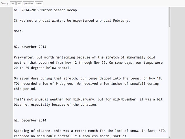
Single screen mode for previewing a post.
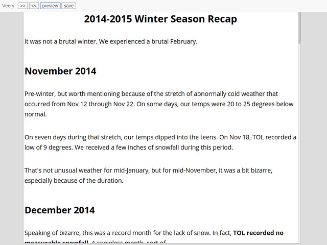
This is a desktop / laptop view after hitting ctrl-j to create a simplified writing environment. No buttons.
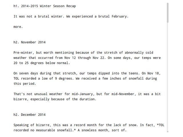
This is a desktop / laptop view after hitting ctrl-d to change the default colors when using the simplified writing environment.
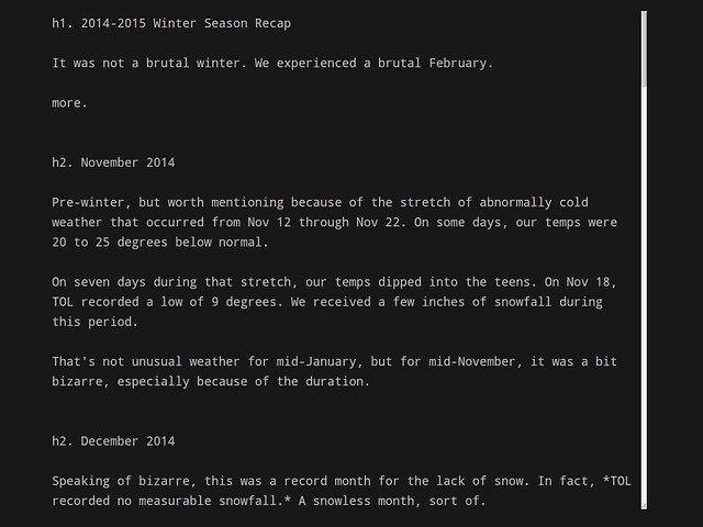
This is a desktop / laptop view after hitting ctrl-h to reduce the writing window to only five lines tall.
Kinglet
Used at http://soupmode.com
It's a private, web-based messaging app. It's sort of a cross between messaging, email, and a message board.
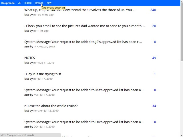
Show the list of my discussion threads.
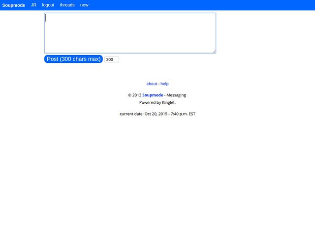
Start a new message thread that will either be sent only to me for a truly private notes thread, or I can include one or more other users for a group message thread.
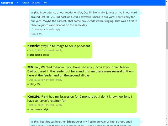
When logged in, this is an example of how the home page would appear.
Junco
Used at http://jothut.com
Junco is a multi-user community app that supports following users, following tags, replies, etc. But for jothut.com, I switched it to single-user mode.
Home page view when I'm logged in. If the app ran in multi-user mode, this would not be the default home page view.
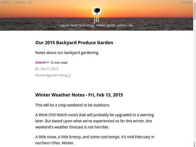
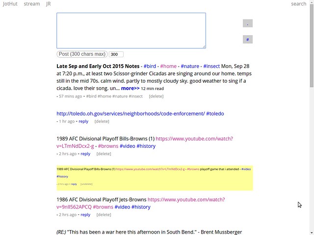
I spend most of my time in the stream view, which is similar to the stream view listed above for Veery. It's also used at Scaup, and it's the view used for the notes section in Grebe.
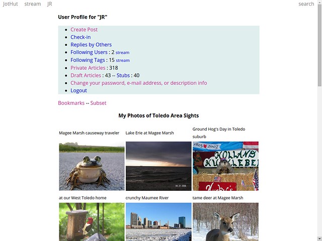
My profile page. The items listed in the light blue background are only shown to me when I'm logged in.
ToledoWX
Used at http://toledoweather.info
jQuery Mobile is used to display pages.
Desktop view of the home page.
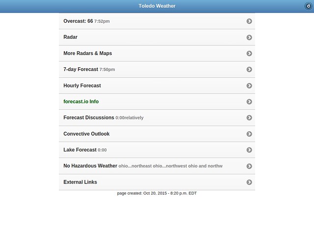
Desktop view of the Forecast.io info page.
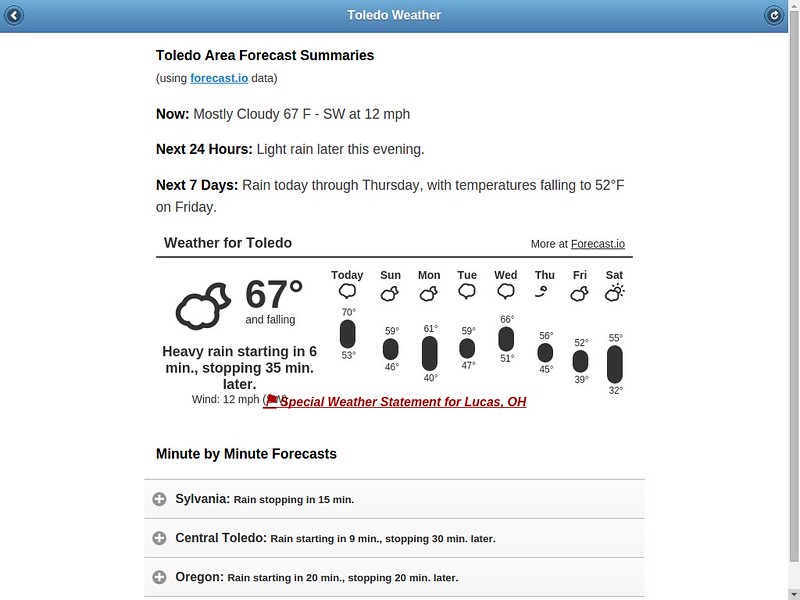
Views on a phone.
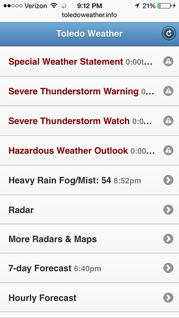
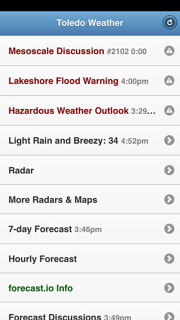
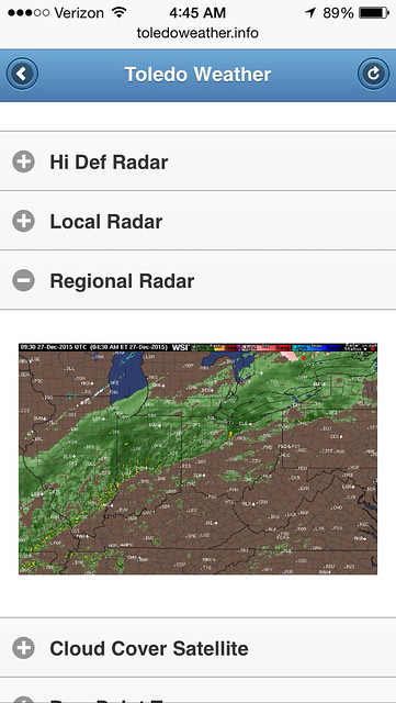
Yo Notifications
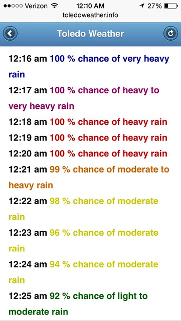
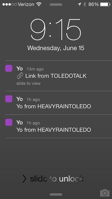
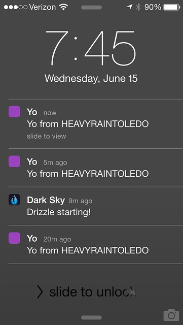
The Yo service offers an API. I use my Yo-Perl module at ToledoTalk.com and ToledoWeather.info to send notifications to my phone. When a new post is made at Toledo Talk, I receive a Yo. When Forecast.io data predicts heavy rain for the area, ToledoWeather.info sends a Yo.
Baby University
Powered by Grebe.
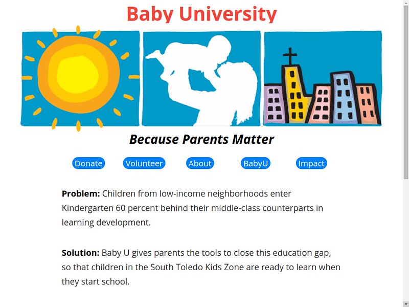
Screenshot of the homepage as of early November 2015.
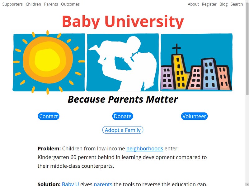
Screenshots of the homepage as of 2016. The buttons are now mouse-over-dropdown menus.
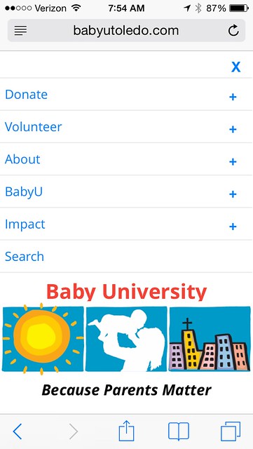
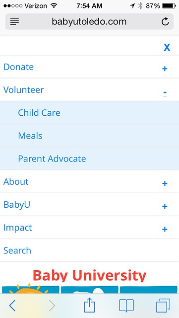
Mobile versions of the most recent homepage.

My iPhone
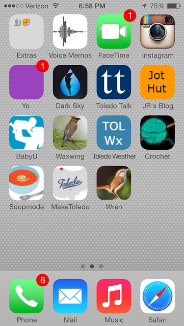
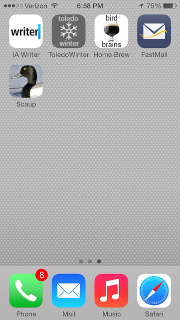
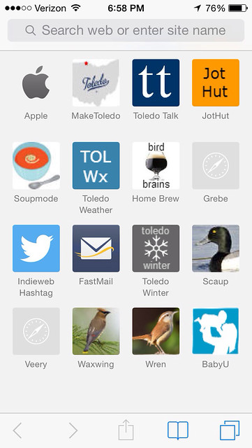
Screen grabs of links to my web apps or sites, saved to the phone's home screen and within the Safari web browser. (iOS 7)
Wren
Used at http://birdbrainsbrewing.com
[screenshots needed]
Map Mashups
Last decade on the ToledoTalk.com server, I created a few map mashups that combined data with Google maps.
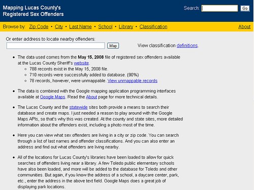
I built my first map mashup in 2005 that mapped Lucas County registered sex offenders, using data from the sheriff's department.
A user could enter an address to show the location of nearby registered sex offenders. I had programmed the addresses for all the county library locations into the database and some of the TPS elementary schools. The user could filter by classification, zip code, city, and last name.
But I unplugged the app a few years later because I received multiple lawsuit threats. I used government data. Even when I explained that the person was still in the latest file produced by the sheriff, I still received the threats.
The last time that I processed the data was in 2008. I've disabled viewing of that map app. The other map mashups don't display content anymore because of tech changes by Google.
Some old screenshots from 2008:
Home Page
Offenders that lived in 43613
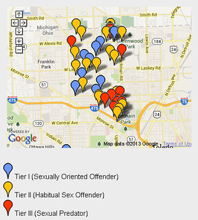
The Tier III (Sexual Predators) in the county
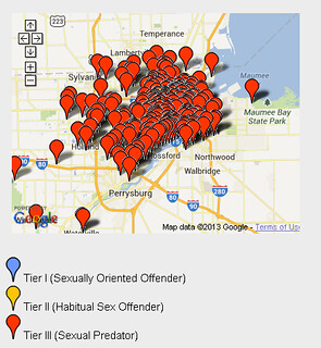
Obviously, it was possible to zoom in on the maps and click the push-pins for details, which should information for each individual. The names of the registered offenders were also displayed on the web page outside of the map area.
ToDo
Add screenshots for the following areas:
- bottom of a veery home page
- more phone screenshots
- toledo talk home page, logged in, new comments to read
- wren
https://www.flickr.com/photos/131621939@N03/tags/screenshot/
From JR's : articles
1626 words - 9709 chars
- 9 min read
created on
updated on
- #
source
- versions
- backlinks