You're viewing old version number 4. - Current version
Tt post feb 23 2017
http://www.leadershiptoledo.org
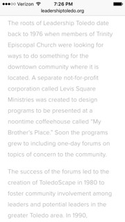
justread, can you convince them to increase the contrast of the text against the white background? The grey or light grey text is hard to read, especially on the phone with the too small font size. I assume that they want people to read the website without pain.

If black on white is too harsh, then at least #333333 would be an improvement over #a3a3a3. Not everyone has 20/20 vision. I avoid reading websites that are reader-hostile.
From an accessibility standpoint, the #a3a3a3 text on the #ffffff background is below 3:1, which is unacceptable.
- Why are so many sites using gray text? - Is there some backroom deal with eyedrop vendors?
- How the Web Became Unreadable - I thought my eyesight was beginning to go. It turns out, I’m suffering from design.
- I can't read your website -
http://wave.webaim.org/report#/http://www.leadershiptoledo.org/
"Hatred toward a fundraiser that supports leadership development and social awareness for youth and adults alike. In a town that really needs leadership. Pretty dam negative."
I agree.
http://www.leadershiptoledo.org
I'll reserve my hatred for their website design. It appears that the website has interesting content that I would like to read, but I avoid websites that are reader-hostile.
justread, can you convince them to tweak their Squarspace theme to increase the contrast of the text against the white background? The light grey text is hard to read, especially on the phone with the too small font size. I assume that they want people to read the website without pain.

If black on white is too harsh, then what about #222222 or at least #333333. That would be an improvement over #a3a3a3. Not everyone has 20/20 vision and brand new computer screens.
The contrast ratio of #a3a3a3 against #ffffff is below 3:1, which is unacceptable from an accessibility standpoint.
==============================="Hatred toward a fundraiser that supports leadership development and social awareness for youth and adults alike. In a town that really needs leadership. Pretty dam negative."
I agree.
http://www.leadershiptoledo.org
I'll reserve my hatred for their website design.
It appears that the website has interesting content that I would like to read. I realize that I'm in the minority group who still loves text. Here are a few quotes by others on the subject.
- Good writing is arguably the most important piece of a design project. - #
- Good writing is good design. - #
- As product designers, our hero must always be the content. Technologies fade into the background. Content stands alone. - #
- When you respect the reader, the content itself is the only relevant medium. - #
- ... the most powerful tool on the web is still words. At its heart, web design should be about words. - #
- The content is the interface. - #
- Designing for the web is still about words. - #
- Write well first. Design well second. - #
- Don’t tell us text is not important. 95% of what is commonly referred to as web design is typography. - #
- A great web designer knows how to work with text not just as content, he treats “text as a user interface”. - #
- If a website is difficult to navigate or read, they'll leave. - #
- There’s no higher priority than readable text. - #
- Don’t tell us to adjust the font size. Don’t tell us to get glasses. - #
- When people say "My old tired eyes can't read this" It is because they can't. - #
Regardless of how good the content is, I have little to no patience for websites that are reader-hostile, despite the tools at my disposal for altering the site on my end.
justread, can you convince them, maybe with a donation in my name, to tweak their Squarspace theme to increase the contrast of the text against the white background? A contrast ratio of less than 3:1 probably violates accessibility guidelines.
The light grey text is hard to read, especially on the phone with the too small font size. I assume that they want people to read the website without pain. Not everyone has 20/20 vision and brand new computer screens.
I think that only one simple modification is needed: change #a3a3a3 to #222222, assuming black on white is too harsh.
The site's About page:

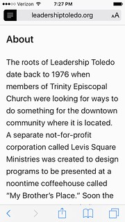
Same page but displayed with Safari Reader enabled.

- Why are so many sites using gray text? - Is there some backroom deal with eyedrop vendors?
- How the Web Became Unreadable - I thought my eyesight was beginning to go. It turns out, I’m suffering from design.
Typography may not seem like a crucial design element, but it is.But if the web is relayed through text that’s difficult to read, it curtails that open access by excluding large swaths of people, such as the elderly, the visually impaired, or those retrieving websites through low-quality screens.
So why are designers resorting to lighter and lighter text [and tiny font sizes on phones]?
... when you design in perfect settings, with big, contrast-rich monitors, you blind yourself to users. To arbitrarily throw away contrast based on a fashion that “looks good on my perfect screen in my perfectly lit office” is abdicating designers’ responsibilities to the very people for whom they are designing.
From JR's : articles
869 words - 5183 chars
- 4 min read
created on
updated on
- #
source
- versions