You're viewing old version number 28. - Current version
New Toledo Region Branding Info - April 2014
"they've updated the online version with more examples of the overall branding."
Indeed. The Blade story that started this thread contains info that I missed in the original story.
Old ToledoRegion.com logo:
![]()
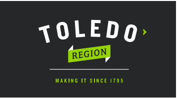
New logo:
New Toledo Region branding kit - (pdf file) - includes images, font types, and color schemes.
# 262729
# d1d3d3
# ffffff
I like the badges, icons, or whatever they're called. Even birdwatching has one. It was an activity mentioned on the old site.

Some other images from the new branding kit:


quote=175029
That's probably why a blank one existed, so you could, you know, fill in what you want.
IN TOLEDO."
#toledo - #design - #advertising - #business
From JR's : articles
119 words - 792 chars
created on
updated on
- #
source
- versions
Related articles
Toledo Region Branding Initiative - Nov 10, 2017
New Toledo Region Branding Info - April 2014 - Apr 16, 2014
Thu, June 30, 2016 links to read - Jun 30, 2016
Black Cloister interior design details - Mar 20, 2015
May 2015 AHA Big Brew Day - Apr 27, 2015
more >>