You're viewing old version number 51. - Current version
Design by Writing
Links to external sources of inspiration, along with a few links to my own thoughts.
https://marco.org/2013/03/02/type-engine
http://www.dal.ca/webteam/web_style_guide/writing_for_the_web.html
Content
- Good Writing and Editing Is Part of Great Design
- Content is the hero
- Content as Medium
- Words
- Reminder: Design is still about words
- Subcompact Publishing
- 6 simple tips for designing copy on the Web
Design
- Dieter Rams: ten principles for good design
- Dieter Rams – 10 principles for good design - applied to mobile apps
- Learning to See
- Blogs for Readers - Hacker News discussion
- This is my favorite website
- The 100% Easy-2-Read Standard from 2006
- This is a motherf*cking website
- This is still a motherfucking website
- The Honest Web Design
- Optimal Characters Per Line
- Responsive Typography - The Basics
- Web Typography
- Fonts Have Feelings Too
- The importance of emotion in design
- Reader First Internet
- Re-thinking linking
- The Value of Content
- http://www.typewolf.com/cheatsheet
- Readability
- https://www.readability.com
- http://www.pearsonified.com/typography
- http://www.studiopress.com/design/google-font-combinations.htm
http://backstage.pickcrew.com/update-blog/ - http://www.codeitpretty.com/2013/05/blog-font-style-with-css-spacing.html
- http://www.smashingmagazine.com/2009/08/20/typographic-design-survey-best-practices-from-the-best-blogs/
- http://typographica.org
- http://www.pearsonified.com/2011/12/golden-ratio-typography.php
- http://typecast.com/blog/a-more-modern-scale-for-web-typography
- http://jothut.com/cgi-bin/junco.pl/blogpost/339/27Jun2013/Resolved-Experiment-with-fonts-and-CSS
- https://eev.ee/blog/2016/03/06/maybe-we-could-tone-down-the-javascript/
Recommendations
- 55 to 75 characters per line on desktop/laptop
- line height of 140 to 160 percent
- font size of at least 20 px
- letter spacing of 0 to 1 px depending upon font type
- letter-spacing: 0.01em; ??
- paragraph spacing? twice the line height? more than two times line height?
What often gets missed is proportion. On every device, our H1s are three times (3em) the size of the body, every H2 is 2.25em, and so on.
After a lot of experimentation, 35–40 characters per line on a typical smartphone seems to me to provide the best balance for more legible and readable text.
Etc.
This page works because it easily provides information that is useful for interested readers. No web-abusive aesthetic cruft is used to infuriate the reader. This single page is more superior in web design than the web sites of Twitter, Pinterest, etc. because those giant properties abuse normal web behavior that has existed for more than 20 years. We don't need websites to act like native apps.
http://www.shelaghlewins.com/tablet_weaving/TW01/TW01.htm
https://news.ycombinator.com/item?id=6549018
Blogs are my newspapers, thats why. For me accessibility and downwards compatability outweigh the "product" a lot. I have a low-end smart phone for which most "products" are ununsable. Why do people throw away expensive hardware that woks perfectly fine? Because the modern software doesn't run on it.Take for example the opposite: http://blog.fefe.de
That is a product that meets my demands: I can read on any device, using multiple clients. I could read this page with a dual-core as well as with a gameboy. Serve TTF font's, maybe I rather use bitmap fonts? Doesn't matter.
I could read that blog using Mosaic, lynx, w3m... kindle displays... It also works fine for braille terminals.
I guess I am more interested in powerful systems than the pityful products of the App-bubble. After all I am a programmer.
http://the-magazine.org -- (oct 15, 2015 : i don't know why i included The Magazine)
My Sep 8, 2015 ToledoTalk.com comment in a thread about the Toledo Blade's new mobile web format where I mentioned what I would like to see in a Blade web design for article pages. My entire comment:
I'd pay nice money for a Blade subscription if the article pages looked something like this:http://toledotalk.com/last-alarm.html - (blatant copyright violation. will remove later.)
... instead of this:
http://www.toledoblade.com/Police-Fire/2014/01/31/Last-Alarm-rings-for-fallen-heroes.html
... and instead of this:
http://m.toledoblade.com/Police-Fire/2014/01/31/Last-Alarm-rings-for-fallen-heroes.html
I don't need a printed paper version. I don't need an app. I prefer one website that responds comfortably on all devices and loads fast with no mountains of JavaScript bilge, no huge irrelevant images, no ads, and no trackers and other gobbledygook that bog down page load speed.It would be nice if the article page contained a large-ish font size and a lot of negative space. I don't understand why some responsively-designed websites use a tiny, uncomfortable font size on mobile.
I see no need for a bunch of navigation links in the header and footer areas of an article page. No fixed areas. No hamburger or similar menu icons, like I use here. The only link needed is a link to the home page. The reader can find all the site's link cruft on the home page.
Outside of links contained within the article, the only other acceptable link would be to a separate page that contains the Facebook comments, pertaining to the article. If I'm a buying a subscription, I do not want to see Facebook comments loaded on the same page as the article because that slows down the page load and fouls the overall look of the page.
On an article page, I want at least 99% of the page to focus on the article: Title, secondary title, author, contact info, publish date, and content.
Give non-paying customers the hideous views, and give subscribers something worth buying. Until this utopia exists, I'll continue reading with JavaScript disabled, which improves the web-viewing experience a lot.
While not perfect, some good design concepts for an article page can be gleaned from this site.The humorous content is directed at web designers/developers. Excerpts:
Let me describe your perfect-ass website:
- Shit's lightweight and loads fast
- Fits on all your shitty screens
- Looks the same in all your shitty browsers
- The motherfucker's accessible to every asshole that visits your site
- Shit's legible and gets your fucking point across (if you had one instead of just 5mb pics of hipsters drinking coffee)
This is a real, naked website. Look at it. It's fucking beautiful.
What I'm saying is that all the problems we have with websites are ones we create ourselves.
Websites aren't broken by default, they are functional, high-performing, and accessible. You break them. You son-of-a-bitch.
"Good design is as little design as possible."
- some German motherfucker
My follow-up comment
The Microsoft Edge browser is intriguing.I use Linux for my desktop/laptop system. On Linux, I use the Chrome and Firefox web browsers.
For Firefox, I have JavaScript disabled by default for all websites. I use the NoScript and Ghostery plugins. I can enable functionality as I need it with NoScript.
For Chrome, cookies are blocked for all websites by default, but I have JavaScript enabled for all websites by default. Then I use cookie and JavaScript exception rules to allow or disallow those functions for various sites.
On my iPhone, I use the Chrome and Safari web browsers.
With Chrome, I have the Readability extension installed, which "cleans up" a web page.
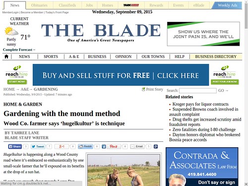
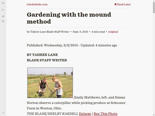
Sep 9, 2015 Blade gardening story
Normal view with everything enabled within the browser.
Same page viewed with the Readability extension.
http://whoo.ps/2015/02/23/futures-of-text
http://graydon2.dreamwidth.org/193447.html
Text is the most socially useful communication technology. It works well in 1:1, 1:N, and M:N modes. It can be indexed and searched efficiently, even by hand. It can be translated. It can be produced and consumed at variable speeds. It is asynchronous. It can be compared, diffed, clustered, corrected, summarized and filtered algorithmically. It permits multiparty editing. It permits branching conversations, lurking, annotation, quoting, reviewing, summarizing, structured responses, exegesis, even fan fic. The breadth, scale and depth of ways people use text is unmatched by anything. There is no equivalent in any other communication technology for the social, communicative, cognitive and reflective complexity of a library full of books or an internet full of postings. Nothing else comes close.So this is my stance on text: always pick text first. As my old boss might have said: always bet on text. If you can use text for something, use it. It will very seldom let you down.
A commenter stated what I works for me:
Everything you say is true; even so, you leave out one point that’s crucially important, at least to me: text is also the most efficient technology when it comes to bridging that last gap between the computer and the human mind. Send me a link to a news story that turns out to be a video, or an audio file, and I’ll close it unconsumed: I haven’t got that kind of time. Send me a transcript: I’ll finish reading in half the time it would take me to passively sit there while it played, and I’ll more clearly remember it.
Rules For Visual Storytelling
(2016) edition
Image related, but the ideas could apply to text too.
https://twitter.com/brianboyer/status/708261070520111105
1. If you make the reader click or do anything other than scroll, something spectacular has to happen.
2. If you make a tooltip or rollover, assume no one will ever see it. If content is important for readers to see, don't hide it.
3. When deciding whether to make something interactive, remember that getting it to work on all platforms is expensive.
- Archie Tse, Deputy Graphics Director, NYT
Presented at Malofiej 24
http://www.malofiejgraphics.com
The Society for News Design (SND) is a nonprofit organization that brings together around 2,600 visual journalists (designers, infographers, illustrators,…) from around the world. The Society’s annual activities, its competition and publications have been essential references for newspapers and magazines worldwide since the late 70′s, when it was created with the expressed purpose of fostering publications that are more easily accessible to their readers.
http://www.bloomberg.com/features/2016-jack-dorsey-twitter-interview/
march 2016 - twitter's 10-year anniversary -
quote by jack dorsey:
"I think independent of the visual medium, text always has a place in the world. I don't think that's ever going away. As we talk about these shifts toward visual, I think it is important to remember that the written word is always going to be something that's important and useful."
By JR
- 1580 words
created:
- updated:
source
- versions
Related articles
Design by Writing - Apr 03, 2016
Designing websites for readers and writers - Mar 24, 2015
The top features for community sites are users and their content - Oct 03, 2014
Interesting Tech and Writing Info - Dec 14, 2015
Proposed Ghost blogging platform - Feb 13, 2014
more >>

