New Toledo Region Branding Info - April 2014
(some of my info that I posted at ToledoTalk.com)
"they've updated the online version with more examples of the overall branding."
Indeed. The Blade story that started this thread contains info that I missed in the original story.
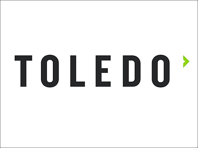
Old ToledoRegion.com logo:
![]()
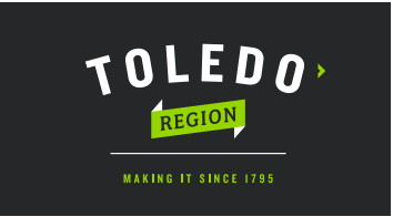
New logo:
New Toledo Region branding kit - (pdf file) - includes images, font types, and color schemes.
# 262729
# d1d3d3
# ffffff
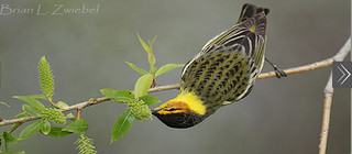
I like the badges, icons, or whatever they're called. Even birdwatching has one. It was an activity mentioned on the old site.
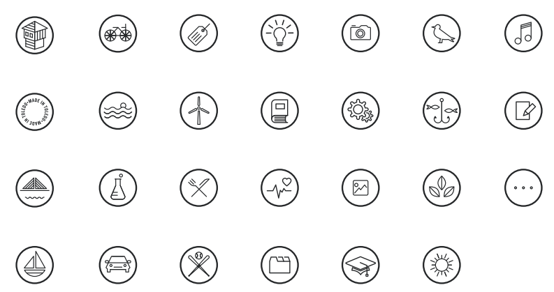
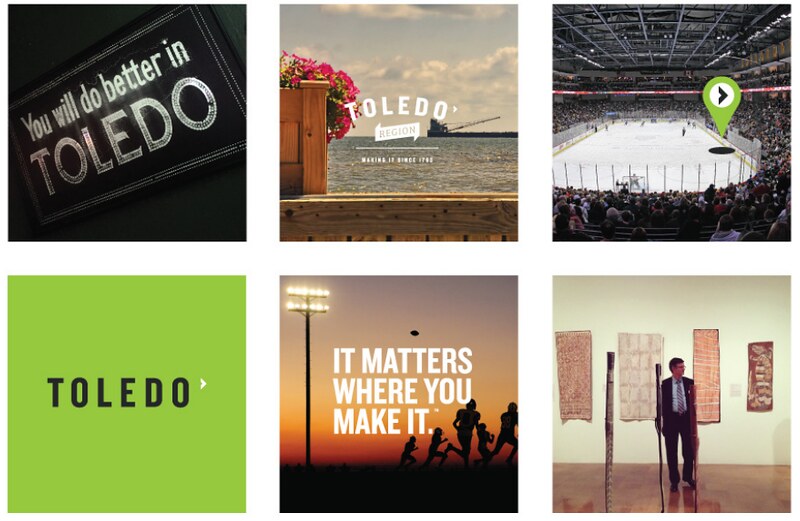
Some other images from the new branding kit:


quote=175029
That's probably why a blank one existed, so you could, you know, fill in what you want.
IN TOLEDO."
You can use this HTML at Toledo Talk. Replace the three questions marks with whatever.
<div style="margin-top:20px; color:#262729; font-size:130%; font-weight:bold;">"I MAKE <span style="color:#95d600; font-family:cursive; text-decoration:none; border-bottom:2px solid #262729; font-size:130%; vertical-align:super;">???</span>
<br /><span style="padding-left:10px;">IN TOLEDO.</span>"
</div>IN TOLEDO."
my apr 7, 2014 comment:
That's hilarious. WSPD attempts to ridicule design work from a Toledo firm by pointing to the wrong logo. Apparently, accuracy is optional at the station.
makeit=Epic Fail
I doubt WSPD is qualified to discuss design based upon the look of their website.
makeit=Ugly
It's interesting that the top of the WSPD site states, "Toledo News, Traffic, & Weather," but they have a drop-down menu option titled "NSFW." I could understand that kind of data existing on WIOT's site, but I guess class is also optional at the so-called news station.
makeit=infantile behavior
The right arrow in the new logo design that indicates forward reminds me of what exists in mobile apps and image slide shows or carousels where the right arrow usually implies more info, next, or forward.
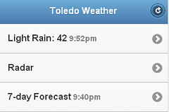
The new logo design could have applications on the web or in apps.
This is simple HTML not an image, so it looks plainer, but the arrow and the text at the bottom are links that point to the same page.
-
#toledo - #design - #advertising - #business - #blog_jr
By JR
- 351 words
created:
- updated:
source
- versions
Related articles
Toledo Region Branding Initiative - Nov 10, 2017
Hyperlocal media insights - Mar 03, 2014
Creating and curating local news - Jul 15, 2014
Thu, June 30, 2016 links to read - Jun 30, 2016
Custom Toledo-area weather Web site - Mar 03, 2014
more >>