Tt post about article design - mon, sep 8 and tue, sep 9, 2015
I'd pay nice money for a Blade subscription if the article pages looked something like this:
http://toledotalk.com/last-alarm.html - (blatant copyright violation. will remove later.)
... instead of this:
http://www.toledoblade.com/Police-Fire/2014/01/31/Last-Alarm-rings-for-fallen-heroes.html
... and instead of this:
http://m.toledoblade.com/Police-Fire/2014/01/31/Last-Alarm-rings-for-fallen-heroes.html
I don't need a printed paper version. I don't need an app. I prefer one website that responds comfortably on all devices and loads fast with no mountains of JavaScript bilge, no huge irrelevant images, no ads, and no trackers and other gobbledygook that bog down page load speed.
It would be nice if the article page contained a large-ish font size and a lot of negative space. I don't understand why some responsively-designed websites use a tiny, uncomfortable font size on mobile.
I see no need for a bunch of navigation links in the header and footer areas of an article page. No fixed areas. No hamburger or similar menu icons, like I use here. The only link needed is a link to the home page. The reader can find all the site's link cruft on the home page.
Outside of links contained within the article, the only other acceptable link would be to a separate page that contains the Facebook comments, pertaining to the article. If I'm a buying a subscription, I do not want to see Facebook comments loaded on the same page as the article because that slows down the page load and fouls the overall look of the page.
On an article page, I want at least 99% of the page to focus on the article: Title, secondary title, author, contact info, publish date, and content.
Give non-paying customers the hideous views, and give subscribers something worth buying. Until this utopia exists, I'll continue reading with JavaScript disabled, which improves the web-viewing experience a lot.
While not perfect, some good design concepts for an article page can be gleaned from this site.
The humorous content is directed at web designers/developers. Excerpts:
Let me describe your perfect-ass website:
- Shit's lightweight and loads fast
- Fits on all your shitty screens
- Looks the same in all your shitty browsers
- The motherfucker's accessible to every asshole that visits your site
- Shit's legible and gets your fucking point across (if you had one instead of just 5mb pics of hipsters drinking coffee)
This is a real, naked website. Look at it. It's fucking beautiful.
What I'm saying is that all the problems we have with websites are ones we create ourselves.
Websites aren't broken by default, they are functional, high-performing, and accessible. You break them. You son-of-a-bitch.
"Good design is as little design as possible."
- some German motherfucker
my sep 9, 2015 post:
quote=194986
Thanks. The Microsoft Edge browser is intriguing.
I use Linux for my desktop/laptop system. On Linux, I use the Chrome and Firefox web browsers.
For Firefox, I have JavaScript disabled by default for all websites. I use the NoScript and Ghostery plugins. I can enable functionality as I need it with NoScript.
For Chrome, cookies are blocked for all websites by default, but I have JavaScript enabled for all websites by default. Then I use cookie and JavaScript exception rules to allow or disallow those functions for various sites.
On my iPhone, I use the Chrome and Safari web browsers.
With Chrome, I have the Readability extension installed, which "cleans up" a web page.
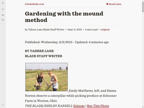
Sep 9, 2015 Blade gardening story
Normal view with everything enabled within the browser.
Same page viewed with the Readability extension.
From JR's : articles
585 words - 3755 chars
- 3 min read
created on
updated on
- #
source
- versions
- backlinks
Related articles
Using the Links web browser - Apr 23, 2016
Video ads within Facebook's Instant Articles - Mar 31, 2016
Digital media and web services unbundling their products - Jun 04, 2014
LA Times new website design - May 2014 - May 27, 2014
The homepage is dead - May 21, 2014
more >>